
When you start thinking about how to choose an interior color palette, you might feel excited, confused, or even overwhelmed. Most people do. There are countless shades, finishes, and combinations, and every paint aisle somehow looks the same after a while. But the truth is simple: picking the right colors is less about rules and more about understanding how colors behave in real rooms. In this guide, I’ll walk you through home color scheme ideas that actually work, why they work, and how you can apply them in any home without second-guessing yourself.
Let’s make color easy, practical, and fun.
Start With How You Want the Room to Feel - Not What You Think It Should Look Like
Before you look at a single paint sample, ask yourself one question: What do I want this room to feel like?
Most people jump straight to picking colors and end up stuck. But the feeling comes first, because color controls mood more than anything else.
Here’s what I mean:
- Calming: soft blues, warm whites, dusty greens
- Energizing: corals, yellows, bright whites
- Cozy: deep browns, muted reds, warm greiges
- Fresh and airy: pale greens, cool neutrals, clean whites
When you choose a feeling first, your color choices become easy. For example, if you want a peaceful bedroom, you already know neon orange isn’t going on the wall. If you want an office that wakes you up, you won’t pick a sleepy gray.
Tip: Write down three words for how you want the room to feel. Stick to colors that match those words.
Also read: Interior Home Design Tips from Professional Designers.
Understand the Three-Color Formula That Keeps Any Room Balanced
Here’s a simple trick decorators use everywhere. It works in small rooms, big rooms, bright rooms, and tiny apartments.
The 60-30-10 rule:
- 60%: main color of walls
- 30%: secondary color of furniture or large pieces
- 10%: accent color of decor, pillows, artwork
This rule keeps your space balanced without making it look messy or loud. Even if you love bold shades, this method helps you control where the color goes.
Learn the Difference Between Warm, Cool, and Neutral Tones - Your Room Depends on It
Every color falls into one of these groups:
Warm tones:
Yellow, red, orange, terracotta, tan, cream, beige. These make rooms feel cozy, welcoming, and lively.
Cool tones:
Blue, green, purple, gray, charcoal, icy white. These feel calm, refreshing, and open.
Neutrals:
White, gray, black, taupe, and greige. These anchor everything else.
Why this matters: If your home gets lots of sunlight, cool tones balance it. If your home feels cold or shadowy, warm tones make it feel alive.
Before choosing colors, notice the natural light in your room. South-facing rooms love cooler tones. North-facing rooms need warmer tones to avoid looking dull.
Match Your Palette With Your Existing Furniture and Finishes
This part saves the most money and avoids repainting disasters.
Look at what you already own:
- Flooring
- Sofa
- Rugs
- Wood tones
- Kitchen cabinets
- Curtains
- Tiles
These items have fixed colors that won’t change unless you spend money. Your wall color must support them, not fight them.
Here’s how to match:
- Warm wood floors: Choose warm whites, earthy greens, olives, terracotta, and beige.
- Cool gray floors: Choose cool blues, whites, or soft charcoal.
- Dark furniture: Pick medium or lighter wall colors to avoid a heavy look.
- Light furniture: Go bold or dark on walls for contrast.
If you already have a strong pattern like a rug or curtain, pick your palette from there. Pull out two subtle colors and one bold one. This anchors your space instantly.
Think About How Your Rooms Connect - Your Home Should Flow, Not Clash
You don’t need all your rooms to be the same color. But they should feel like they belong to the same home. The easiest way to do that is to choose colors with similar undertones.
For example:
- If you choose a warm greige in the living room, keep warm tones in adjoining rooms.
- If your entryway is a cool white, stick with cool tones in the nearby hallway.
This creates visual flow and prevents your home from feeling chopped up.
A simple way to keep harmony is to pick one “base neutral” that repeats in small ways throughout the house, maybe through trim, doors, or decor pieces.
Use Nature as Your Cheat Sheet - It Never Produces a Bad Palette
When you’re unsure which colors go together, just step outside. Nature has been creating perfect color combinations forever, and it never gets them wrong. Every landscape—whether it’s a forest, beach, or mountain range—offers a ready-made palette you can use at home.
Here are a few nature-inspired color families that always feel balanced and timeless:
Forest Palette:
Deep green, bark brown, warm cream, muted gold. Ideal for cozy, grounded living rooms with a natural feel.
Ocean Palette:
Navy, seafoam, soft sand, driftwood gray. A soothing mix that works beautifully in bathrooms and peaceful bedrooms.
Desert Palette:
Terracotta, beige, soft blush pink, cactus green. Warm, earthy, and perfect for modern living spaces.
Mountain Palette: Slate gray, pine green, fog white, charcoal. A bold, clean combination suited for masculine or minimalist rooms.
Also read: How to Design a Home That Feels Cozy.
Test Paint the Right Way - The Smallest Mistake Can Change an Entire Room
Never, ever pick a color from a tiny paper sample alone. Colors change dramatically in real light.
Here’s the right way to test:
- Paint a 2×2 ft sample on the wall.
- Test it on two walls, preferably one facing light and one in shadow.
- Look at it in the morning, afternoon, evening, and at night with lights on.
- Check it next to furniture or wood tones.
A color that looks perfect at noon might look muddy at sunset. A crisp white might turn yellow under warm bulbs. That’s why testing is critical.
When in Doubt, Start With a Neutral Base and Build Up
If you’re scared of choosing the wrong colors, begin with a simple neutral and build your palette around it.
Reliable neutral bases:
- Warm white is good for cozy rooms
- Cool white are good for modern, bright rooms
- Greige is good for almost anything
- Soft beige is good for warm, classic homes
- Pale gray is good for fresh, simple spaces
A neutral base gives you freedom. You can switch decor anytime, change accent colors every season, or bring in bold pieces without repainting.
Neutrals also work amazingly for open-concept homes because they create unity across the entire space.
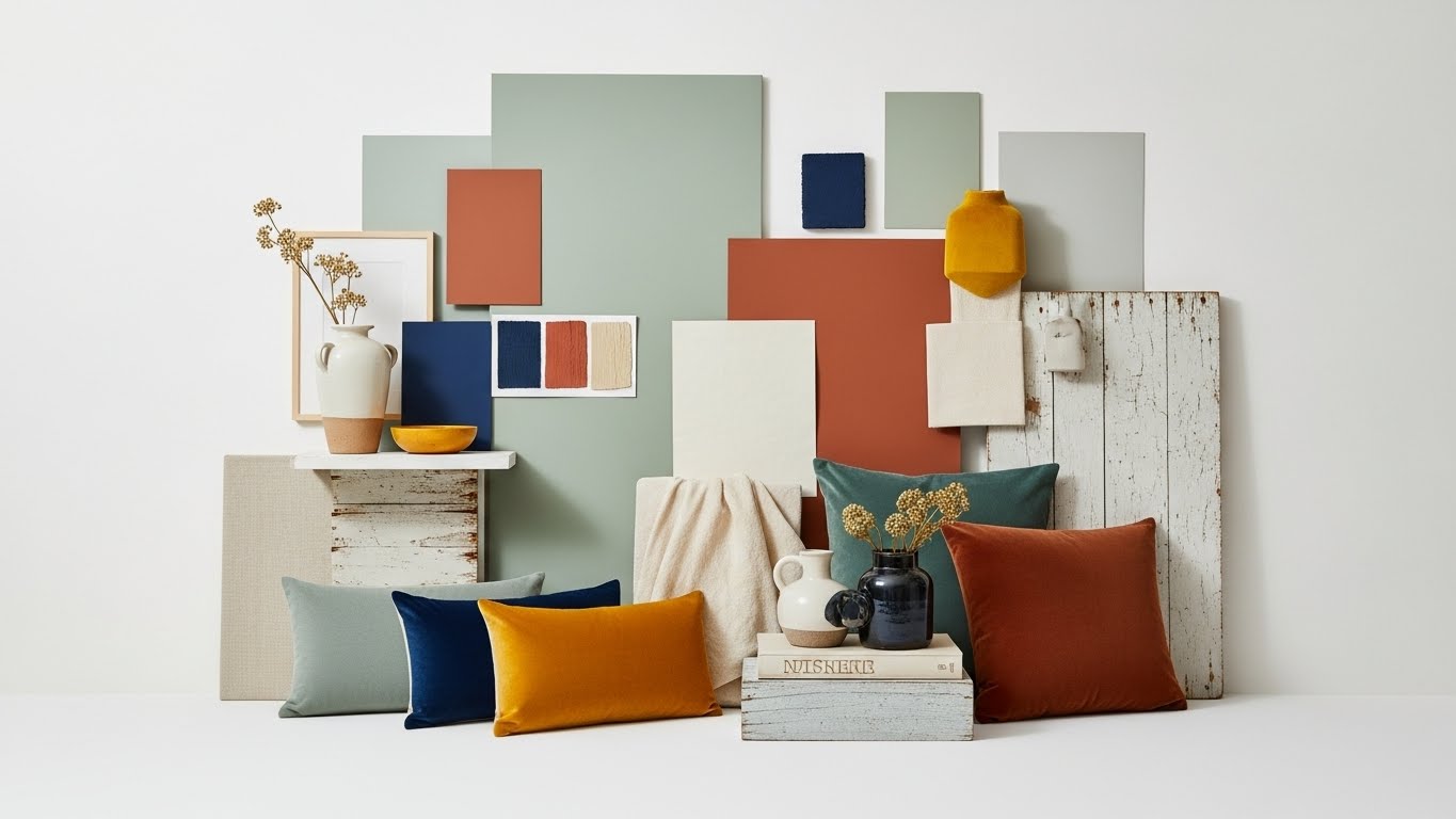
Add Accent Colors That Bring the Room to Life
Accent colors are the personality of your space. They should support your main color, not distract from it.
Good accent ideas:
- Navy with white
- Mustard with charcoal
- Gold with emerald green
- Terracotta with beige
- Black with tan
- Soft pink with gray
Accents can be pillows, artwork, vases, side tables, throws, or even lamp shades. These pieces add rhythm to the room without overwhelming it. Repeat your accent color in at least three different places so the room looks intentional.
Understand Undertones - The Hidden Reason Colors Look Off
Two whites can look completely different. Two grays can clash like enemies. This is because of undertones, the color hiding underneath the main color.
Common undertones:
- Yellow makes a room warm
- Pink makes beige look dated if mismatched
- Blue makes grays feel cool
- Green can turn white a bit minty
- Purple is common in cool grays
If your sofa has a warm beige tone, don’t choose a gray with blue undertones. If your kitchen cabinets are crisp, cool white, don’t choose a creamy, yellowish wall color.
Create Color Palettes Based on Room Function
Living Room
Your living room should feel inviting and relaxed, so warm neutrals, olive green, navy, deep charcoal, and beige work beautifully here. These shades create a cozy backdrop where people feel comfortable gathering and unwinding.
Bedroom
A bedroom needs soft, restful colors. Shades like muted green, soft blue, lavender, and dusty rose help quiet the mind and create a peaceful space where you can actually relax at the end of the day.
Kitchen
Kitchens look their best with clean, crisp tones. White, sage green, navy, and soft gray make the space feel bright, fresh, and organized, perfect for cooking and everyday movement.
Dining Room
Your dining room should feel warm and connected. Rich green, deep navy, warm beige, and charcoal add depth and create a grounded atmosphere that encourages conversation and togetherness.
Office
For a workspace, you need colors that support focus. Light gray, pale green, soft blue, and slate provide a calm but energizing backdrop that helps you think clearly and stay productive.
When each room carries colors that match its purpose, the whole home feels more natural, comfortable, and intentional.
Use Color to Highlight the Best Parts of the Room
Color doesn’t just decorate, it shapes the architecture of the room.
Here’s how:
- Dark walls make rooms feel dramatic and cozy.
- Light walls make rooms feel bigger and brighter.
- Painting trims the same color as the walls makes the room look taller.
- Painting ceilings a lighter shade opens up the space.
- Using stripes or color blocks adds structure.
If your room has a great window, paint the wall around it a contrasting shade so it stands out. If your room has awkward angles, paint them the same color as the main wall so they disappear.
Pull Color Inspiration From Real Objects, Not Just Paint Decks
Sometimes your best color inspiration is already in your home.
Try this:
- Take a pillow you love.
- A photo.
- A rug pattern.
- A piece of pottery.
- A painting.
- A fabric swatch.
- Even a piece of clothing.
Designers often say: Start with one hero piece. That one item can guide your entire palette.
Look at the color combinations inside the item. You’ll see harmony, contrast, light, and dark already balanced for you.
Use Lighting to Bring Out the Best in Your Palette
Your color isn’t finished until you choose the right lighting.
Warm bulbs:
Make rooms feel cozy and soften cool colors.
Cool bulbs:
Sharpen neutrals and brighten warm tones.
Daylight bulbs:
Give a crisp, natural look.
Lighting can shift colors by two or three shades, so test your bulbs with your paint samples before finalizing the palette.
Keep It Personal - Your Home Should Reflect Who You Are
At the end of the day, color is personal. Trends change every season, but you live with these colors every day.
So choose colors that match your style:
- Do you like clean, simple spaces? Stick to soft neutrals.
- Do you love bold style? Try charcoal, emerald, or navy.
- Do you love warm earth tones? Go for terracotta and olive.
- Do you want a calming home? Choose cool greens and blues.
Your palette should make you feel something every time you walk in.
Sample Color Palettes You Can Use Today
Here are ready-to-use home color scheme ideas you can apply immediately.
Modern Warm Home
If you want a space that feels cozy and welcoming, try a palette built around creamy white, warm greige, terracotta, and soft brown accents. These tones add comfort and warmth without feeling heavy.
Cool Minimal Home
For a clean, modern look, pure white paired with light gray, navy accents, and black hardware creates a crisp, minimal style. This palette works well in bright, open spaces.
Earthy Calm Home
Olive green, warm beige, taupe, and brushed gold accents make a room feel grounded and peaceful. This palette is perfect if you like soft, natural tones with a bit of warmth.
Soft Coastal Home
Pale blue, sand beige, white, and slate gray accents bring a fresh, airy feel inspired by coastal landscapes. It’s ideal for bedrooms, bathrooms, or any space where you want calm energy.
Moody Modern Home
Charcoal, warm white, brass accents, and deep green decor create a bold, dramatic look. This palette works beautifully in living rooms, offices, or spaces where you want strong character.
Checklist: Before You Finalize Your Interior Color Palette
Use this list to make sure you’re making the right choice:
- Did you choose a mood for the room?
- Did you understand the natural light?
- Did you match colors to furniture and floors?
- Did you stick to one undertone family?
- Did you test paint at different times of day?
- Did you use the 60-30-10 rule?
- Did you think about room-to-room flow?
- Did you test colors with actual lighting?
If all answers are yes, you’re ready to paint.
Choose Interior Color Palette With Cucine Design NYC
Are you excited to renovate your home interior and confused about color selection? We know it's a difficult task, that’s why our designers at Cucine Design NYC are at your service. They will understand your needs and suggest the best color palette according to your preferences. They will renovate your home and give it a modern, sleek look.
Call us today and let’s start.